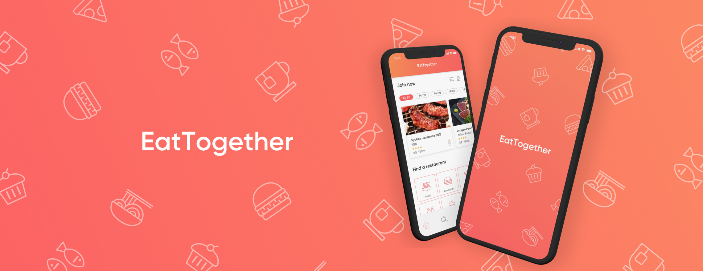
EatTogether is a social app that brings people together through sharing a meal with strangers without any expectations.
Team
Candice Zhou, Leah Wei, Cheston Sin, Ian Orden
Role
User Research, Ideation, Visual Design, User Testing, Prototyping
Timeline
Jan – Mar 2019 (3 months)
Award
RGD 2019 Student Award for Digital Marketing Design
Candice Zhou, Leah Wei, Cheston Sin, Ian Orden
Role
User Research, Ideation, Visual Design, User Testing, Prototyping
Timeline
Jan – Mar 2019 (3 months)
Award
RGD 2019 Student Award for Digital Marketing Design
Although we live in a society more digitally connected than ever, 1 in 5 Canadians identify as being lonely, and more are living alone.
The world today is now more connected than ever digitally, however there is still an issue that revolves around loneliness. Loneliness is subjective and can be experienced in different ways – it doesn’t always mean being alone or not having friends. It is the discrepancy between the social relations you want compared to the ones you have.

A new way to meet people—EatTogether fosters in-person connections by uniting people of all identities through the love of food.
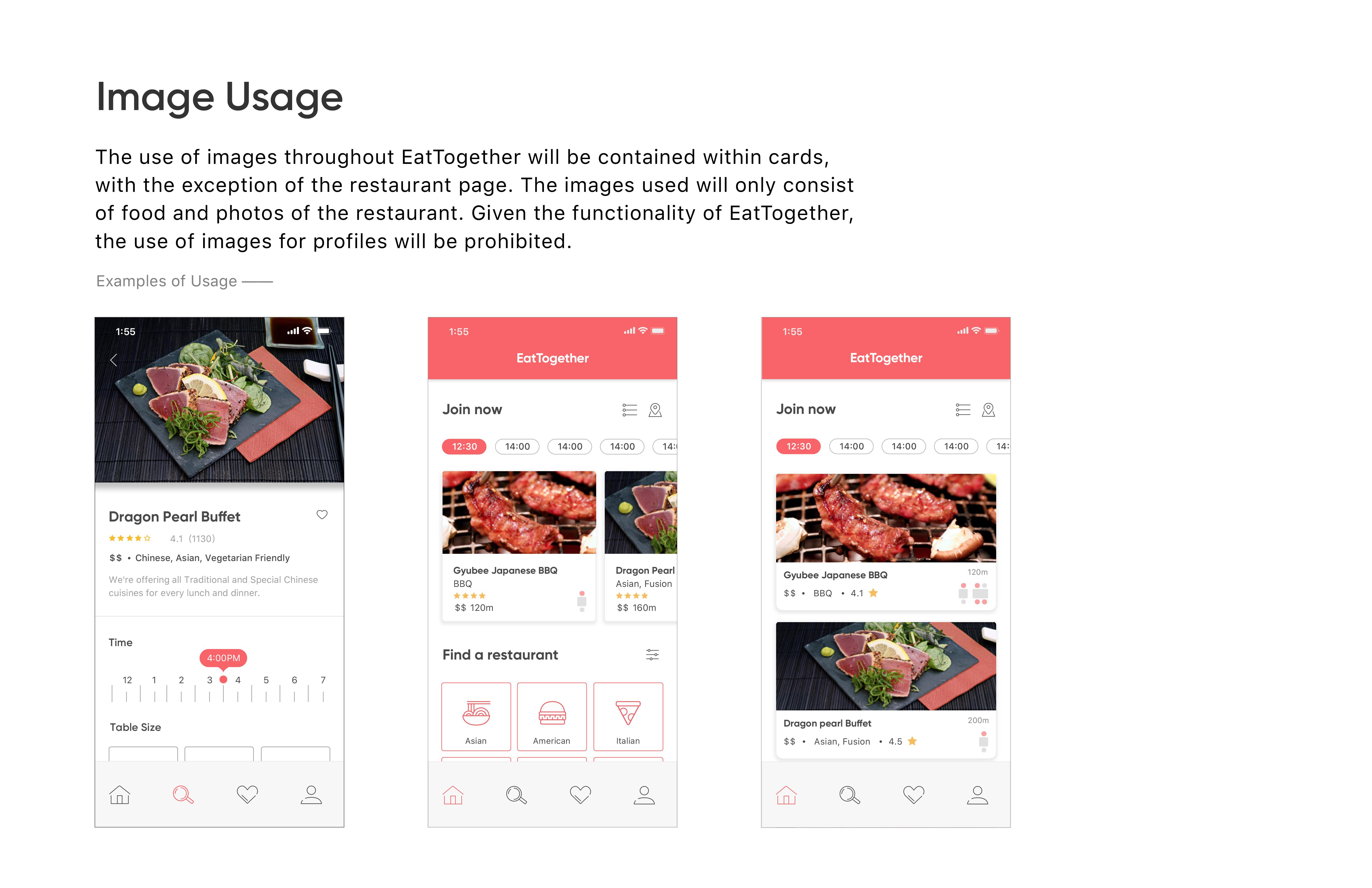
EatTogether is geared towards fostering diverse encounters through one activity we all do — eating. The app will have a broad range of adult users from various backgrounds. People of all different genders, sexualities, ethnicities, cultures, ages, and occupations will be encouraged to use the app. Their identity will be kept anonymous from one another in order to prevent predisposed judgments and expectations from other diners.
Initial Research ->
We started with developing a detailed PACT analysis (People, Activities, Contexts, Technologies) to contextualize the product and its users. We then moved on to developing a MoSCoW chart that lists and prioritizes the different features of the app.
From there, we created user personas and conducted user interviews based on the demographic we decided to focus on. These interviews helped with prioritizing the features within the MoSCoW chart and also new features we didn’t think of. We then created user scenarios to contextualize what the app would be used for.
Full documentation of these can be found here
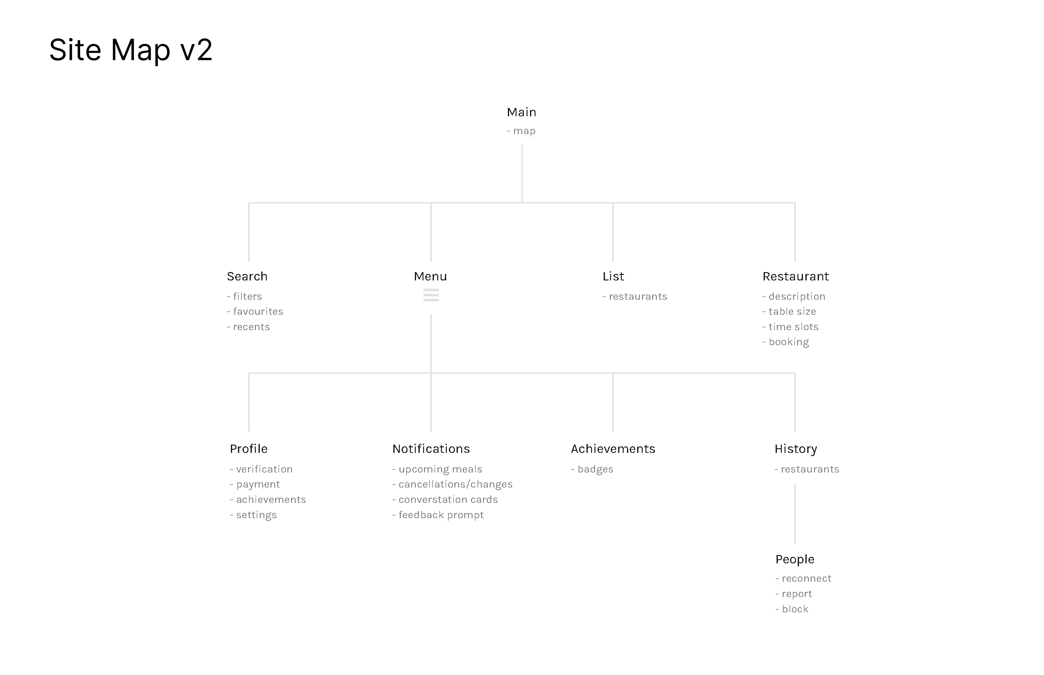
Information Architecture ->
With all the information gathered, we started to organize the app’s information architecture. The site map was then revised after the user testing phase.

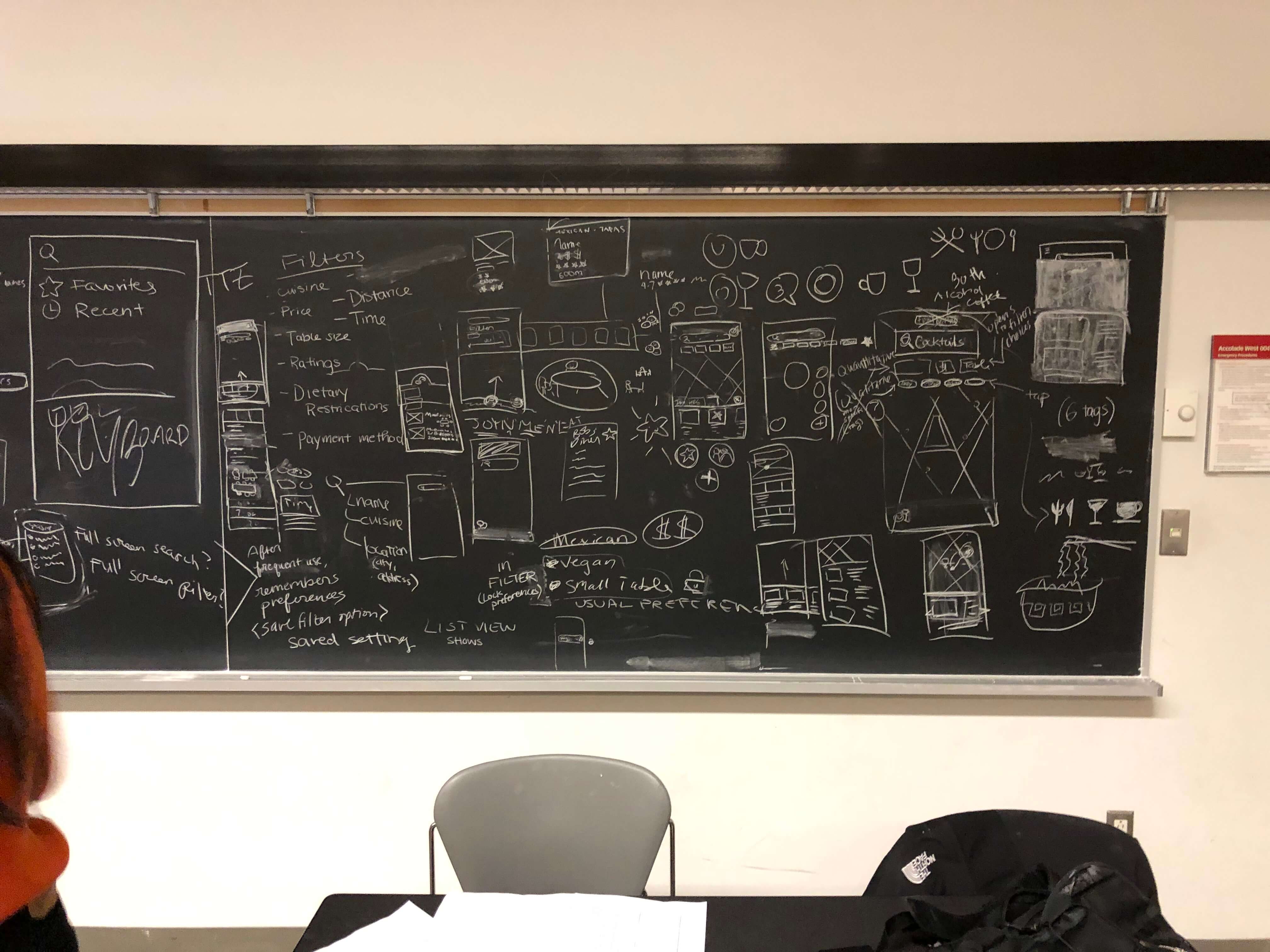
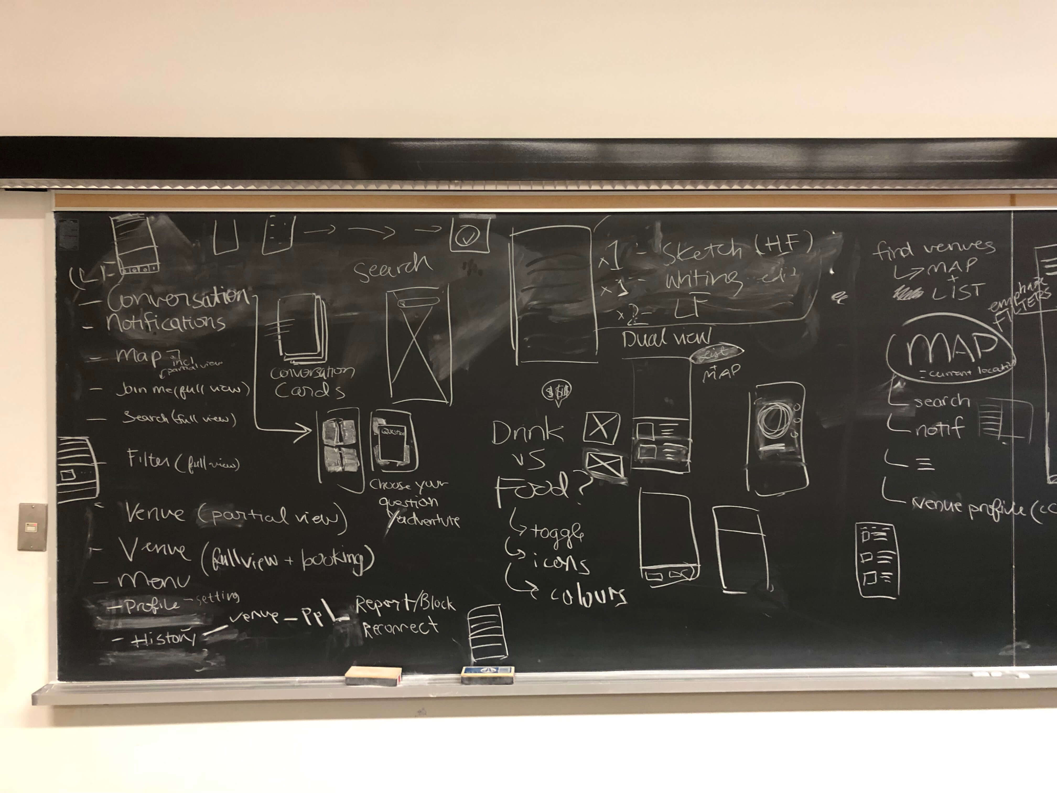
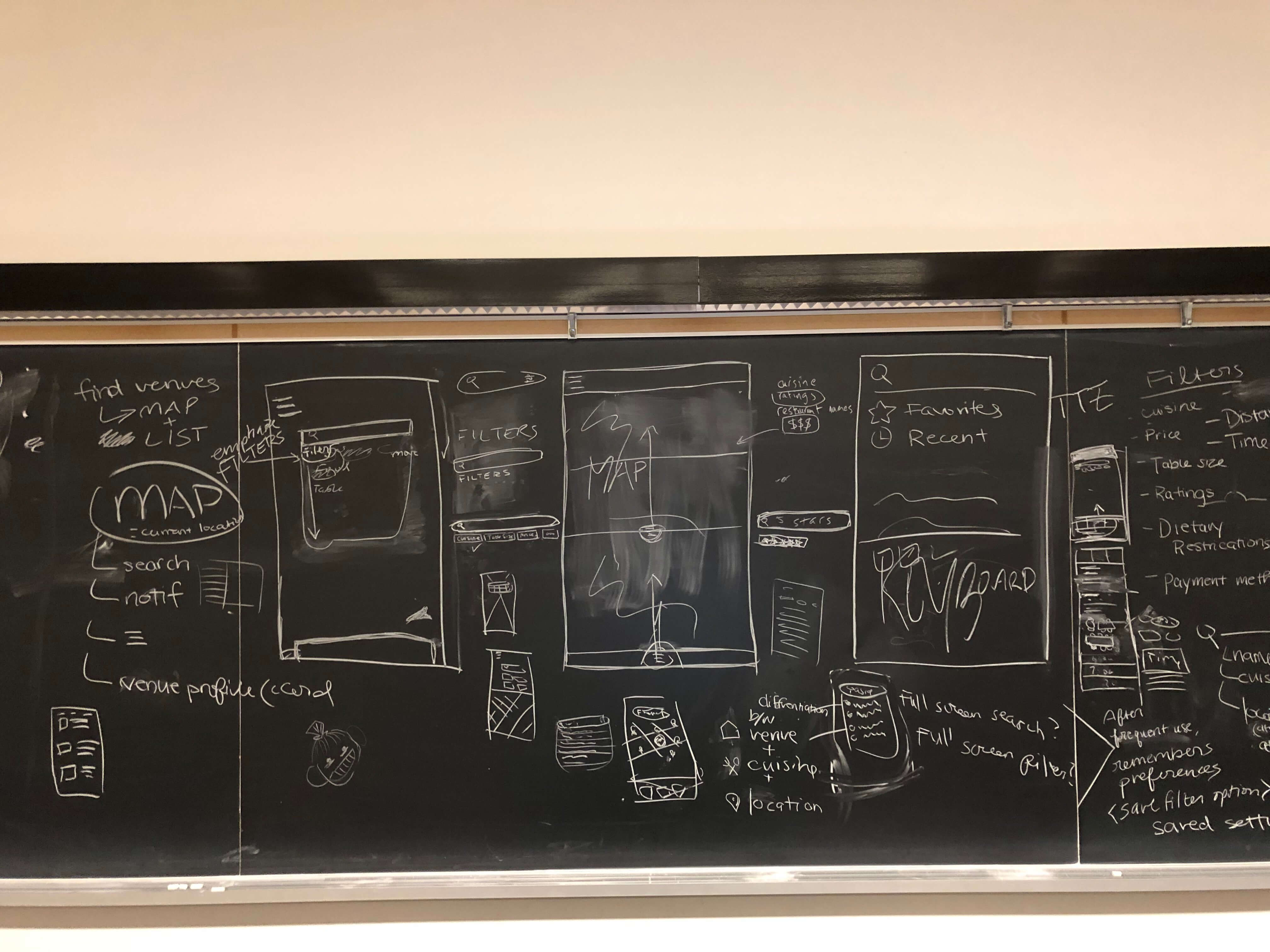
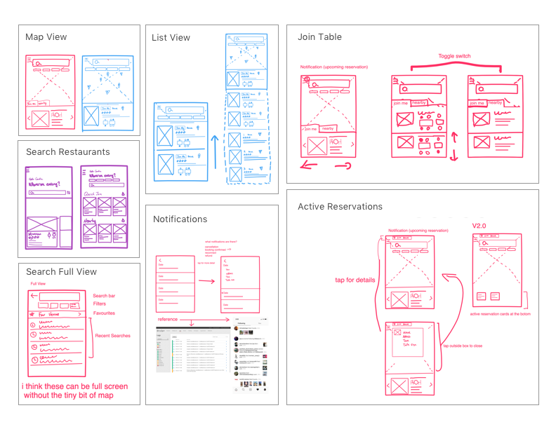
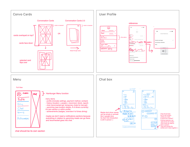
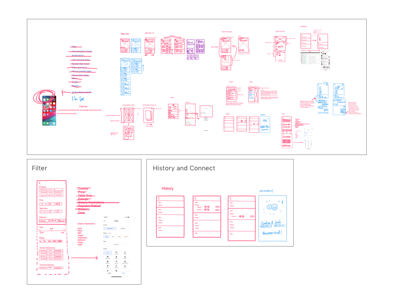
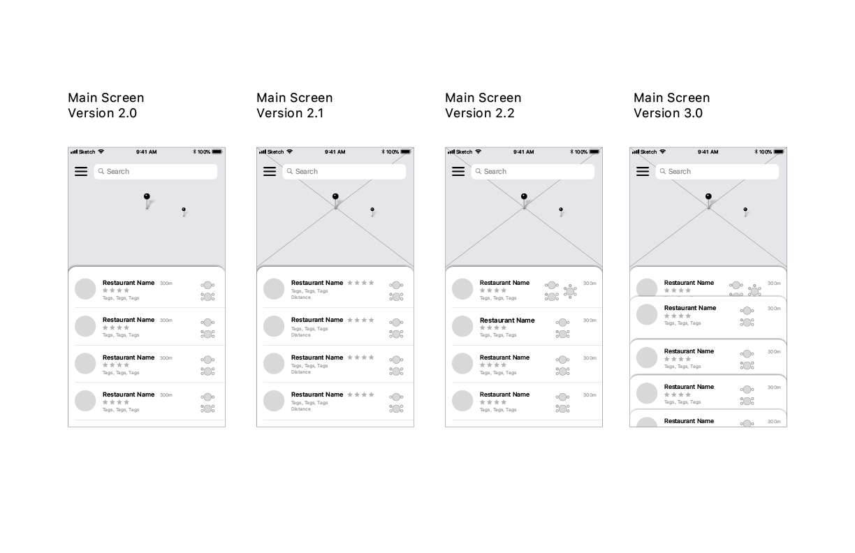
Wireframing ->
Using all the research as a basis, we began to design the screens – starting from sketches to low-fidelity wireframes to high fidelity wireframes.
Visual Style ->
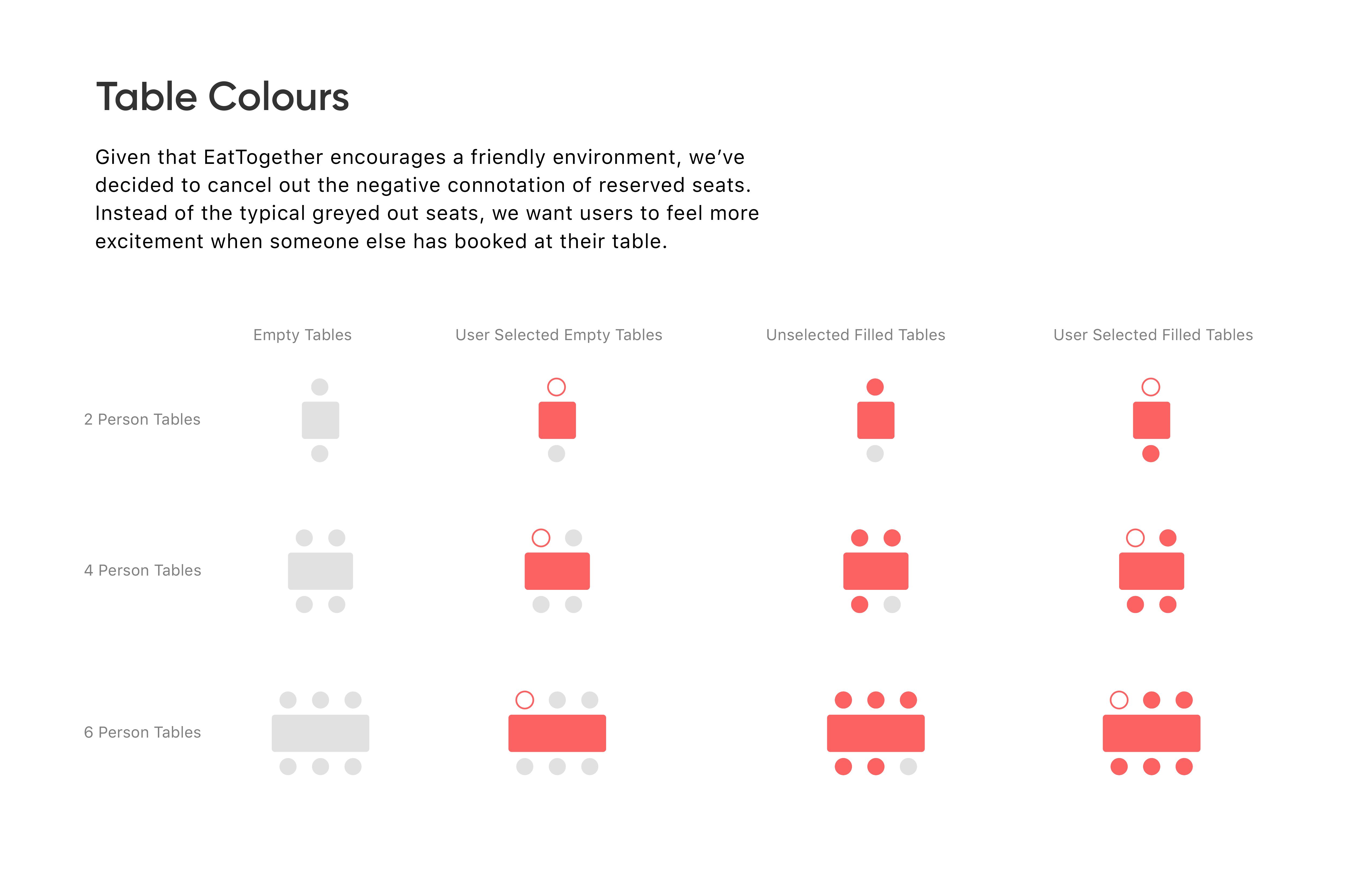
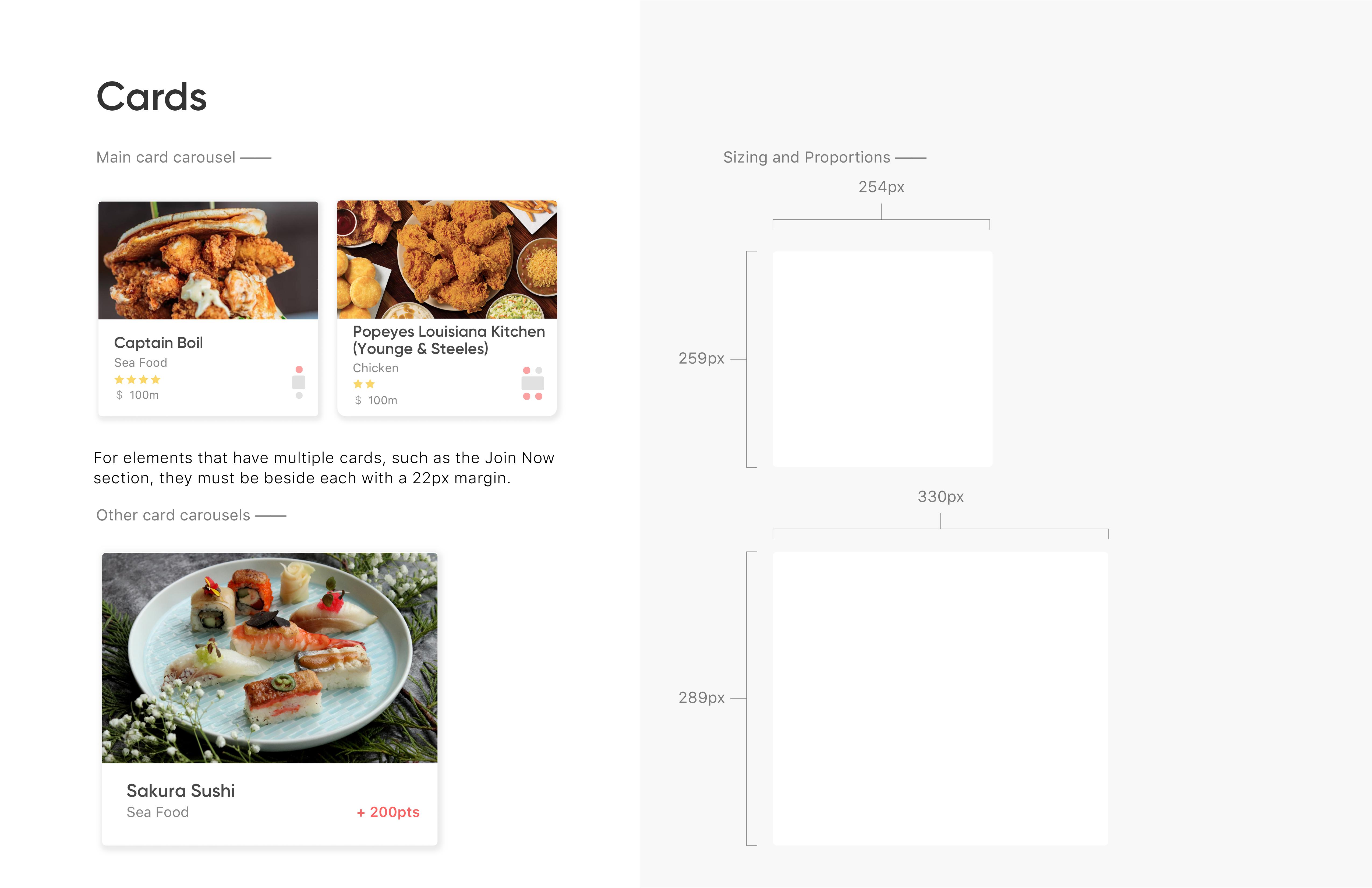
Before we moved on to prototyping, we built a visual design guideline to ensure all the design elements across the product were cohesive.
User Testing ->
We conducted 4 user tests across two target groups - 2 students and 2 office workers. These were conducted in a lab where voice, screen and hand interactions were recorded.
The users were all given the same prompts that included direct commands or questions. (“Check out nearby tables at 1:30PM” or “How much reward credit do you have?”) Through the process, we took turns facilitating the tests, and made sure to remind the users to think out loud and being mindful of giving too much guidance.
Being designers of the product, it was interesting to see how the information was navigated. The results impacted our final design and made the product easier to use.


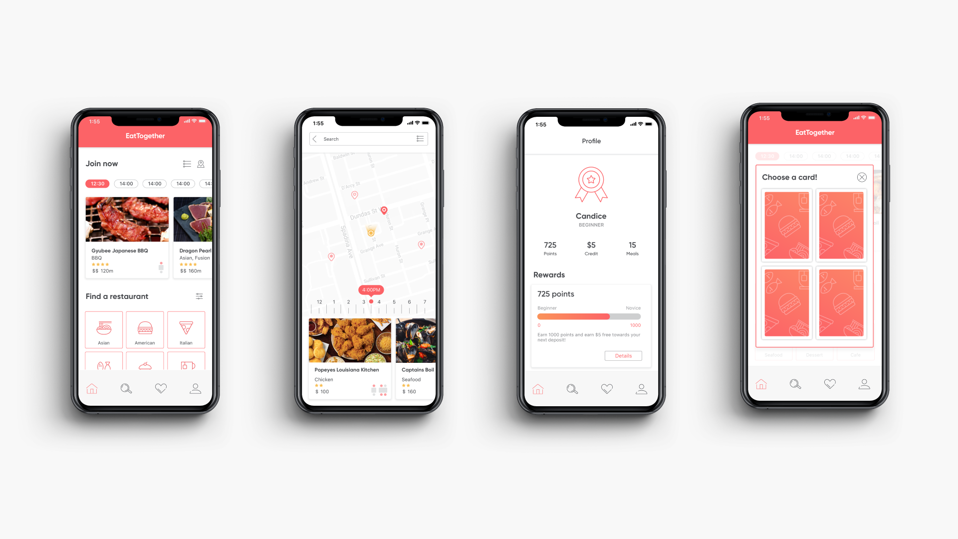
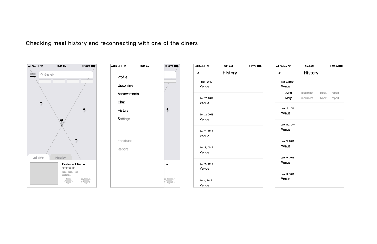
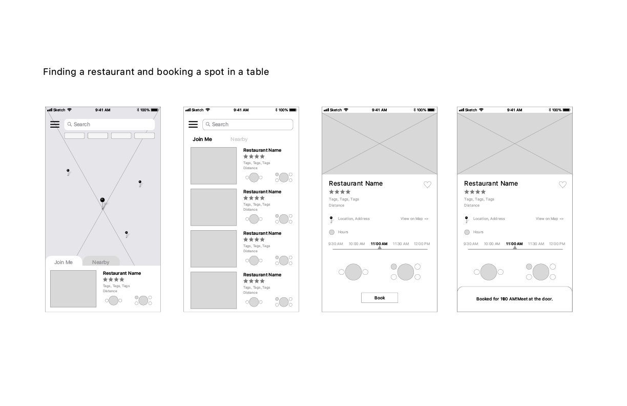
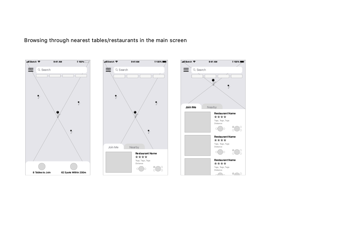
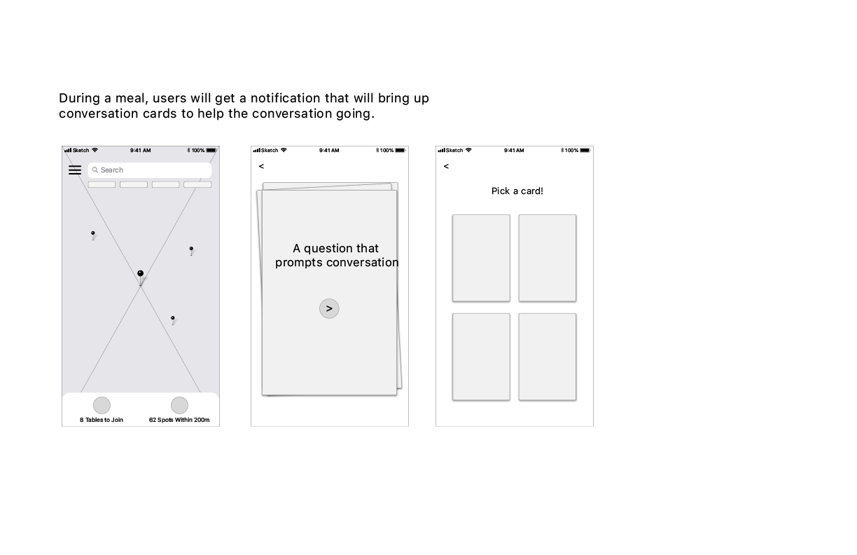
Final Screens ->


